Loading...
点击查看此次 commit
了解流行组件库的 Icon 组件
本篇文章技术来源于
semi design,参考了semi design的 icon 组件库设计
观察我们经常使用的组件库可以发现,大部分的 Icon 图标组件库都是单独抽离成了一个包,而不是耦合到组件库内部,这就产生了一个问题:Icon 组件的样式由 Icon 库自己控制,还是由 UI 组件库控制
- 首先观察知名组件库的处理,如
antdarcotdesignsemi等- 除了
semi在 Icon 内集成了样式,其余都是将 icon 样式的处理交给了 ui 库 - 样式让 ui 库处理,能让 icon 的样式与 ui 设计统一
- 除了
- 所以我们在搭建 icon 组件库的时候,也采用只生成 icon 的方法
icon 图标生成 jsx 的思考
svg 图标在 react 中不能直接作为组件使用,而是要将其转换成 jsx,这个过程总不能一个一个手写吧(如果有几十上百个 icon),那太麻烦了,我们可以利用 svgr 去做一个自动化脚本去生成
初始化 icon 组件库
继续之前的章节,在 packages 下新建 icons 目录,并执行 pnpm init 初始化。
安装 svgr 及其相关的 svg 处理依赖,
pnpm i @svgr/core @svgr/plugin-jsx svgo -D@svgr/core@svgr/plugin-jsx是转换 svg 的核心依赖包svgo是辅助工具,对svg的属性等进行转换前的修改
涉及到 jsx,肯定要依赖 react,在 peerDependencies 中添加 react,执行 pnpm install
  "peerDependencies": {
    "react": ">=16.8.0"
  },
再安装 @types/react 类型提示
pnpm i @types/react -D还有最基础的 tsconfig.json,直接使用之前的 rclt-tsconfig 即可
pnpm i rclt-tsconfig --workspace -Dtsconfig.json
{
  "extends": "rclt-tsconfig/react-library",
  "compilerOptions": {
    "target": "ES2016",
    "lib": ["ES2016"],
    "module": "ES2020",
    "noEmit": true
  }
}
编写 Icon 基础组件
新建 src/components 目录
新建 Icon.tsx,这个组件属于一个基础组件,每一个 svg 图标生成的 jsx 都是基于该组件,记得安装 clsx 依赖
import React, { useContext } from 'react';
import type { ComponentType, CSSProperties, DetailedHTMLProps, HTMLAttributes, ReactNode } from 'react';
import clsx from 'clsx';
import IconContext from './context';

export type IconSize = 'small' | 'default' | 'large';

export interface IconProps extends DetailedHTMLProps<HTMLAttributes<HTMLSpanElement>, HTMLSpanElement> {
  svg: ReactNode;
  size?: IconSize;
  spin?: boolean;
  rotate?: number;
  prefixCls?: string;
  type?: string;
}

const Icon = React.forwardRef<SVGSVGElement, React.PropsWithChildren<IconProps>>((props, ref) => {
  const { svg, spin = false, rotate, style, className, type, size = 'default', ...restProps } = props;
  const ctx = useContext(IconContext);
  const prefixCls = props.prefixCls || ctx.prefixCls || 'rclt';

  const classes = clsx(
    `${prefixCls}-icon`,
    {
      [`${prefixCls}-icon-small`]: size === 'small', // 12x12
      [`${prefixCls}-icon-default`]: size === 'default', // 16x16
      [`${prefixCls}-icon-large`]: size === 'large', // 20x20
      [`${prefixCls}-icon-spinning`]: !!spin,
      [`${prefixCls}-icon-${type}`]: !!type,
    },
    className,
  );

  const outerStyle: CSSProperties = {};
  if (Number.isSafeInteger(rotate)) {
    outerStyle.transform = `rotate(${rotate}deg)`;
  }

  const styles = { ...outerStyle, ...style };

  return (
    <span role="img" ref={ref} aria-label={type} className={classes} style={styles} {...restProps}>
      {svg}
    </span>
  );
});

Icon.displayName = 'Icon';

const convertIcon = (Svg: ComponentType, iconType: string) => {
  const InnerIcon = React.forwardRef<HTMLSpanElement, Omit<IconProps, 'svg' | 'type'>>((props, ref) => (
    <Icon svg={React.createElement(Svg)} type={iconType} ref={ref} {...props} />
  ));

  InnerIcon.displayName = 'Icon';
  return InnerIcon;
};

export { convertIcon };
export default Icon;
其中的 context.ts 部分如下
import React, { createContext } from "react";

export interface IconContextProps {
  prefixCls?: string;
}

const IconContext = createContext < IconContextProps > {};

export default IconContext;
此时可能看到 context.ts 中的 React 未被使用
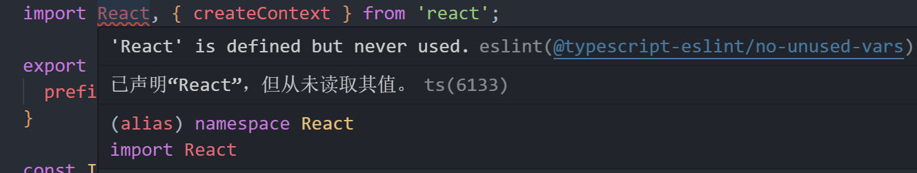
这是为了兼容 react 17 及之前的旧版本,可以去 eslint.config.mjs 中规避一下这个问题
    rules: {
      // ...
      '@typescript-eslint/no-unused-vars': [
        'error',
        {
          argsIgnorePattern: '^_',
          varsIgnorePattern: '^_|^React$',
          caughtErrorsIgnorePattern: '^_',
        },
      ],
    },
好了,这样我们的 Icon 基础组件就编写完成了,所有 icon 图标都会基于这个 Icon 组件去生成对应的 jsx
svg 转 icon jsx 脚本
新建一个 scripts 文件目录,并新建 transSvgToComponent.ts 文件,注意,这里的脚本直接用 ts 去编写了,运行时会使用 tsx 这个包去运行
思路
此时我们的目录结构如下
- scripts
- src
  - components  # Icon 通用的 BaseIcon 组件
  - icons       # jsx 图标生成处
- svgs # svg 图标源- 读取 svg 的图标
- 通过
svgr将其转换成 jsx- 自定义 jsx 内容模板
- 将 svg 的名字转换成 React 组件名字(
CamelCase格式) - 将自定义模板内容和组件名拼接,生成一个 jsx 的纯 string 内容
- 将模板内容输出到指定的目录下
- 所有新建的组件都写入到入口
index.ts中
读取 svg 图标
既然是编写脚本,那就涉及到文件的读写,再安装 fs-extra(个人喜欢用这个,也可以用 node 自带的 fs)
pnpm i fs-extra @types/fs-extra -DtransSvgToComponent.ts 写入读取的代码
import { fileURLToPath } from 'node:url';
import fs from 'fs-extra';

const entryDir = fileURLToPath(new URL('../src/svgs', import.meta.url));
const outDir = fileURLToPath(new URL('../src/icons', import.meta.url));

const transSvgToComponent = () => {
  // 移除并重新创建目录
  if (fs.existsSync(outDir)) {
    fs.rmSync(outDir, { recursive: true });
  }
  fs.mkdirSync(outDir);
  const svgFiles = fs.readdirSync(entryDir, 'utf-8');
  console.log(svgFiles);
};

transSvgToComponent();
此时可以去执行一下脚本,但是 ts 文件是无法执行的,这里就用 tsx 这个库进行 ts 文件运行了。
pnpm i tsx -D在 package.json 中添加命令
  "scripts": {
    "gen:icon": "tsx  ./scripts/transSvgToComponent"
  },
此时可以看到输出了 svgs 文件夹下的 svg 图标名称,输出结果如下:
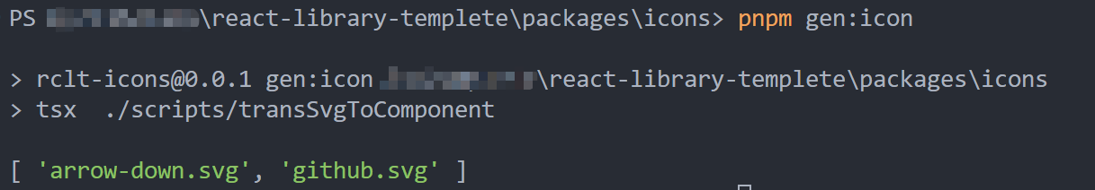
使用 svgr 转换组件
可以结合 svgr 文档 看
此时我们需要考虑一个问题:
svg 图标名称不一定遵循 CamelCase 格式,需要将名字转换为 CamelCase。
我们可以安装 camelcase 来解决这个问题,虽然可以手写,但是既然有现成的库,就不手写了。
pnpm i camelcase -D完善脚本代码
import { fileURLToPath } from 'node:url';
import { basename, resolve } from 'node:path';
import fs from 'fs-extra';
import { transform } from '@svgr/core';
import camelCase from 'camelcase';
import prettier from 'prettier';
import prettierConfig from '../../../.prettierrc.cjs';

const entryDir = fileURLToPath(new URL('../src/svgs', import.meta.url));
const outDir = fileURLToPath(new URL('../src/icons', import.meta.url));

const transSvgToComponent = async () => {
  // 移除并重新创建目录
  if (fs.existsSync(outDir)) {
    fs.rmSync(outDir, { recursive: true });
  }
  fs.mkdirSync(outDir);

  const indexFileName = 'index.ts';
  const svgFiles = fs.readdirSync(entryDir, 'utf-8');
  console.log(svgFiles);

  const batches = svgFiles
    .filter((f) => f.endsWith('.svg'))
    .map(async (file) => {
      try {
        const svgFileName = basename(file, '.svg'); // 只取文件名
        const componentName = `${camelCase(svgFileName, { pascalCase: true })}`; // 转换成驼峰命名
        const reactFileName = `${componentName}.tsx`;
        const svgContent = fs.readFileSync(resolve(entryDir, file), 'utf-8');
        const jsxCode = await transform(
          svgContent,
          {
            typescript: true,
            plugins: ['@svgr/plugin-jsx'],
            icon: true,
          },
          { componentName },
        );

        // 代码按照项目的 prettier 进行格式化
        const formattedCode = await prettier.format(jsxCode, {
          ...prettierConfig,
          parser: 'typescript',
          endOfLine: 'lf',
        });

        fs.writeFileSync(resolve(outDir, reactFileName), formattedCode);
        return {
          fileName: reactFileName,
          componentName,
        };
      } catch (error) {
        console.error(error);
        throw error;
      }
    });

  const arr = await Promise.all(batches);

  // 写入 index.ts
  const indexFileContent = arr
    .map((a) => `export { default as ${a.componentName} } from './${a.componentName}';`)
    .join('\n');

  fs.writeFileSync(resolve(outDir, indexFileName), indexFileContent, 'utf-8');
};

transSvgToComponent();
解析以上代码的流程大致就是:
- 过滤
svgs文件夹下的svg文件(只处理 svg) - 将 svg 的文件名转为驼峰命名,转换成符合 react 组件的命名规范
- 使用
svgr转换成 jsx - 将转换出来的 jsx 代码格式化
- 在指定的输出目录写入该 jsx 文件内容
- 在
index.ts导入这个 icon 组件
执行 pnpm gen:icon,就可以观察到 icons 目录下生成了多个 icon 组件。
自定义组件模板
我们生成的组件内容如下:
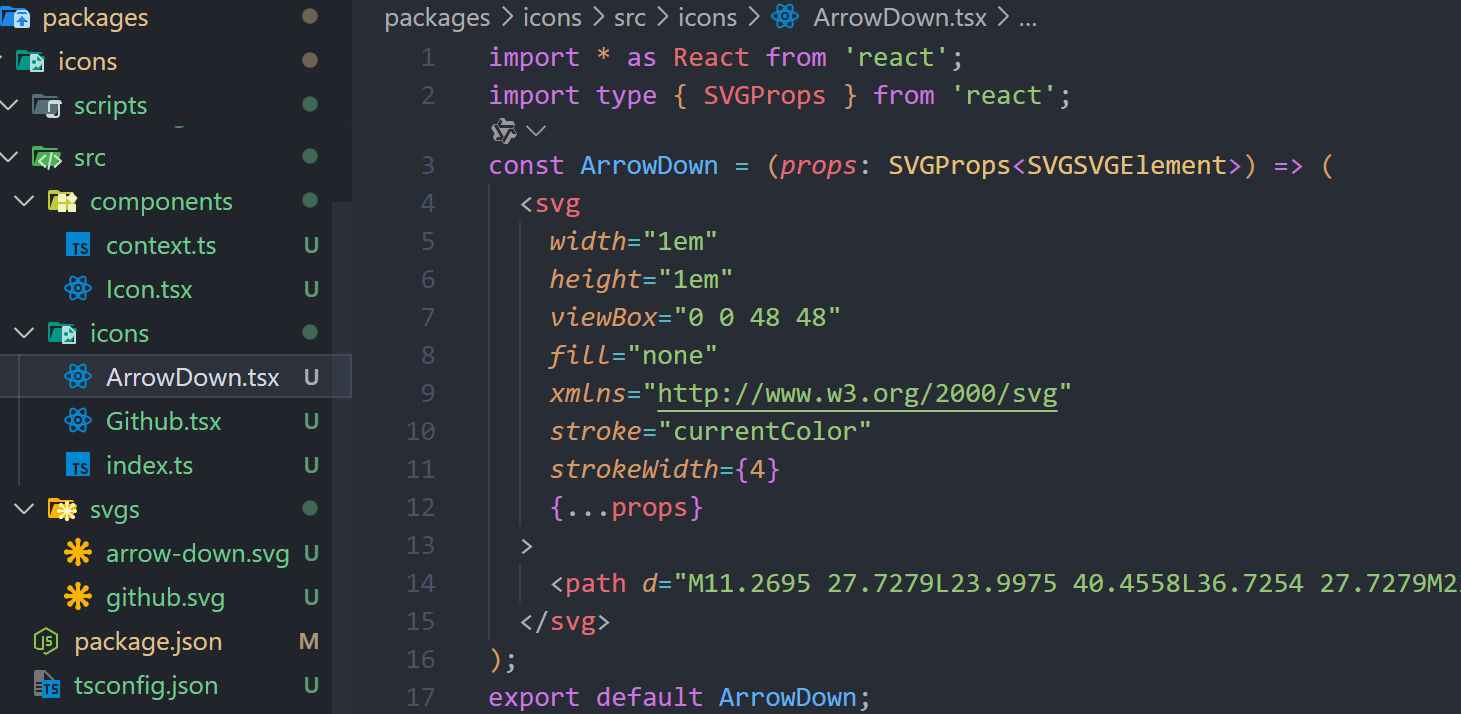
这是 svgr 的 jsx 插件生成的,确实是一个规范的 React 组件,但不是我们想要的 React 组件:
无法基于我们写的 Icon 基础组件生成,这是一个完全独立的组件
为了解决这个问题,我们就需要自定义组件模板来生成我们自己想要的 Icon 组件,可结合 Custom Templete 查看
import { Config } from "@svgr/core";

const customTemplate: Config["template"] = (variables, context) => {
  const { componentName, imports, interfaces, jsx, props } = variables;
  const { tpl } = context;

  return tpl`${imports}
  import { convertIcon } from '../components/Icon';

  ${interfaces}
  function ${componentName}(${props}) {
    return ${jsx};
  }

  const IconComponent = convertIcon(${componentName}, '${getOriginalSvgFileName(componentName)}');

  export default IconComponent;
    `;
};

function getOriginalSvgFileName(componentName: string) {
  const originalFileName = decamelize(componentName, { separator: "-" });
  return originalFileName;
}- 由于 svg 是一个装饰元素,为了更好的语义化,需要给 span 设置
aria-label(通常为 svg 的名字),也就是convertIcon的第二个参数 - 但是很遗憾, svgr 的自定义
templete函数不接受任何除自身以外的参数,就导致无法直接传参得到 svg 的原始名字 - 基于这种情况,我们只能对驼峰命名进行一个逆向解析,得到原始 svg 名字(不一定是原始文件名,只能说转义时按照统一规范命名)
安装 decamelize
pnpm i decamelize -Dsvgr 使用自定义模板
// ...
const jsxCode = await transform(
  svgContent,
  {
    typescript: true,
    plugins: ['@svgr/plugin-jsx'],
    icon: true,
    template: customTemplate,
  },
  { componentName },
);
// ...
再次执行 pnpm gen:icon,查看生成的组件
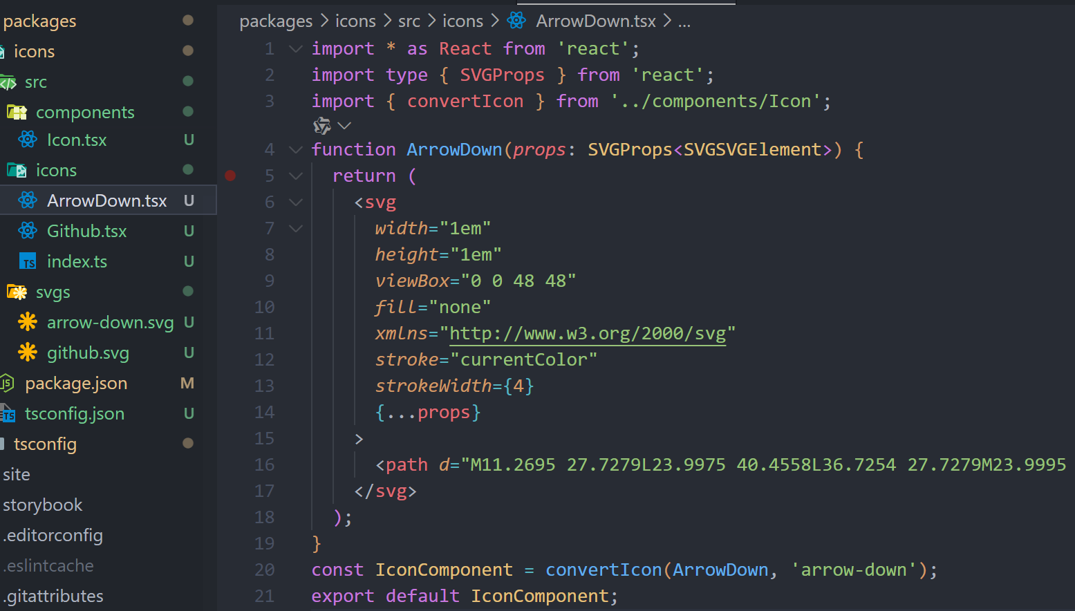
可以看到所有的 svg 组件都使用了 Icon 组件的方法来创建,这样就相当于完成了 Icon 的创建,到这一步基本就属于大功告成了。
细节上的优化
- 由于我们的 svg 为装饰元素(外部用 span 包裹),所以需要不被屏幕阅读器读取,及 svg 上设置
aria-hidden={true}以及其它的一些属性需要关闭,svgr支持直接设置svg的 props - 使用
svgo移除/隐藏/编辑 svg 自带的一些影响渲染结果的元素
import { optimize } from "svgo";

// ...
const svgProps: Record<string, string> = {
  focusable: "{false}", // react focusable={false}
  "aria-hidden": "{true}",
};
const result = optimize(svgContent, {
  plugins: [
    {
      name: "convertColors",
      params: { currentColor: /^(?!url|none)./ },
    },
    "removeDimensions",
  ],
});
const jsxCode = await transform(
  result.data,
  {
    plugins: ["@svgr/plugin-jsx"],
    typescript: true,
    icon: true,
    svgProps,
    template: customTemplate,
  },
  { componentName }
);
// ...
统一导出
在 src 下新建 index.ts,导出所有的 SVGIcon 组件,同时导出基础的 Icon 组件,可以让外部的 svg 做集成。
import Icon from './components/Icon';

export * from './components/Icon';
export * from './icons';

export default Icon;
优化方向
- 现在
svgs目录下都是直接平铺的 svg 图标,可以考虑有嵌套结构下的 svg 图标读取 - 可以给生成的 SVG 组件增加前缀
perfix和后缀suffix - 代码优化,目前所有的代码都堆积到一个文件里,杂揉了很多的不同代码,可以考虑抽离
打包
emm...,没什么好说的了,这一系列前边的文章以及把打包完整讲完了,可以作为参考,当然也可以选择 rollup 打包,因为 Icon 不涉及 css 的样式编排,所以使用 rollup 也是相当不错的选择,只是为了保持统一,尽量使用相同的打包工具,不然遇到一些奇奇怪怪的问题也不是不可能(但是可能性非常小)。